New adventures in Deco
February 26, 20041 min read
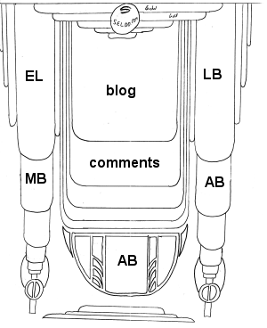 Here's another idea for the design of the front page, which I liked a lot more before I uploaded it. Points to note:
- Unlike the previous scans, this one is based on a much larger drawing, so the details are a lot finer (and I drew the lines with a ruler!) However, widths and heights are still very changeable, especially the size of the decorative fader bars on the extreme right and left.
- It wastes less space than the original design [thanks Ed], and the important elements are not surrounded by too much clutter. There's still lots of white space towards the bottom, but that's a lot more acceptable than wasting space above the fold. And I'm sure I can think of things to put in all those boxes anyway...
- Comments are visible on the front page [thanks Ben] although this will make for some fun security issues that I'll have to defensively code around...
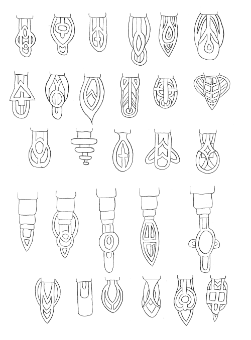
- The design is generally still very baroque. At the bottom of the two smaller columns are two elements (I'm internally calling them bedknobs -- what else would you call them?) whose design I'm not very happy with. I got a bit carried away coming up with other possibilities for them, so now they may become a constantly-changing element -- every 5 minutes, the bedknobs change :-)
- I'm conscious that this design makes it look very similar to, oh, say, every MovableType blog ever, which I'm not very happy about. Surely I can come up with a better way to present these elements?
- One of those AB elements is supposed to be PX. You choose which one.
 This design is supposed to float over a very ornate deco background. Instead of trying to place it in the background as I have previously, here it is roughly as I imagined it. I'm not sure what size this will be relative to the page elements; it may become huge, as I don't want it to stop suddenly in either direction.
