Microsoft is not a web company
I want to talk about Microsoft's web strategy. But Microsoft is a huge company, with a lot of parallel activities in this space, and there are so many angles from which you can approach the subject. So I've decided to focus on a single, instructive example: the front page of Microsoft.com.
Disclaimer: this is a cheap shot. I know it is. A single HTML page does not embody the entirety of Microsoft's strategic direction and corporate culture. I'm also subjecting it to rigorous scrutiny of the kind few web pages get. Nevertheless, Microsoft.com is one of the most popular destinations on the Internet and they are trying to make a name for themselves in the web space and they do have a gigantic budget which they could expend on their front page.
Here's where my journey began, and what started my investigation that led to this post. This is the front page of Microsoft.com, rendered in Firefox (v3.0.5, Windows XP). This and all subsequent screenshots are cropped; click for the full capture.
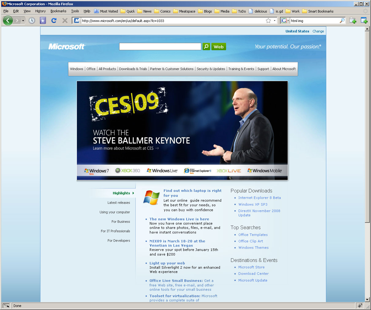
It looks... odd. The big center image and the nav bar at the top are different widths, as is the lower section with content and navigation. The navbar has too much vertical whitespace and the left and right edges are oddly cropped. The alignment and relative vertical sizes of the logo, the search box, and the slogan at the top are odd. The whole thing looks like a rendering error. This impression was reinforced when I moused over the menu bar, and it looked like this:

Okay, this is clearly broken. The white overlaps the border of top of the navbar, there's no gradients to fit in with the rest of the look, the menu is gigantic and doesn't have a top border, making it look odd in the top-left corner. Clearly, Microsoft doesn't care about what this page looks like in Firefox. So I decided to see what it looked like in other browsers. Here it is in Safari (v3.2.1, Windows XP):
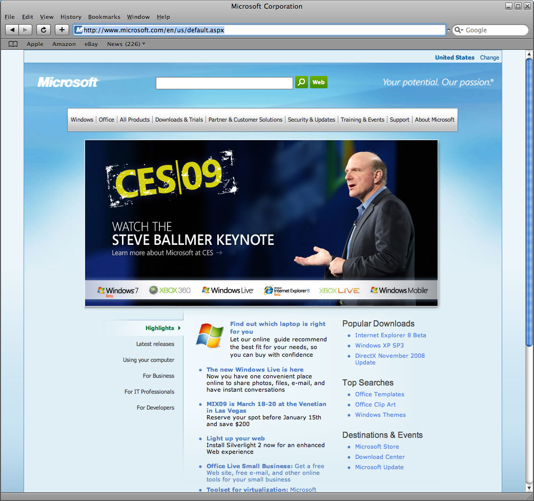
Huh. Well, it looks pretty much the same. The green search buttons are now out of alignment with the search box, but otherwise it doesn't look that different. What about that crazy menu, does it look any better? It turns out the menus don't work in Safari. They just click through to a full HTML page containing all the same content. What? How, in 2009, do you fuck up your javascript so badly that you can't get drop-down menus to work? Aren't you a software company? Could you maybe throw an engineer at that hefty, complicated "drop down menus in web pages" problem, currently being solved by a 13-year-old making his WordPress theme? Or just read the first hit on Google on the subject, which explains how to do it without using Javascript at all?
Okay, fine, they must just hate Apple. Let's try it in Opera (v9.63, Windows XP):
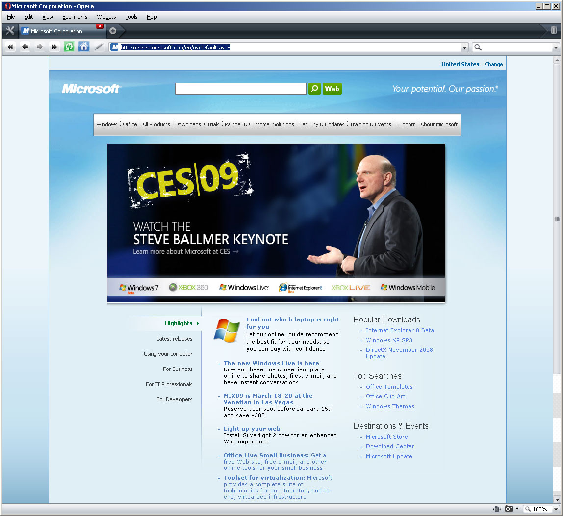
Looks pretty much the same. Search buttons are back in place. How about that menu?

Woah, still gross. That 1-pixel overlap on the left just shouts "we were not ready to launch". At this point I decided to take a look at the code and see what's going on. This is a really low blow -- the code on the frontpage of Yahoo!, where I work (important disclaimer), is no picnic. People do weird things to get performance optimized on these giant pages, things that are a bad idea 95% of the time. Here's what the code looks like when you open it up (yes, also an image, I'm being lazy):

That's the whole page, btw: there are only 4 line breaks in the entire page. Uh... okay? I'm sure you're just very concerned about saving space. Let's pretty-print that code and see what we got:

Oy. 3 script tags in the head, and two external style sheets? Plus a bunch of embedded scripts everywhere else. Consolidating CSS and JS and putting scripts at the bottom of the page are some pretty basic performance tweaks. But I'm not going to go into a long dissection of the code. It's not too bad, and front pages are weird, as I've said. Now let's see what this page is supposed to look like. Here it is in IE6, Microsoft's 8-year flagship product:
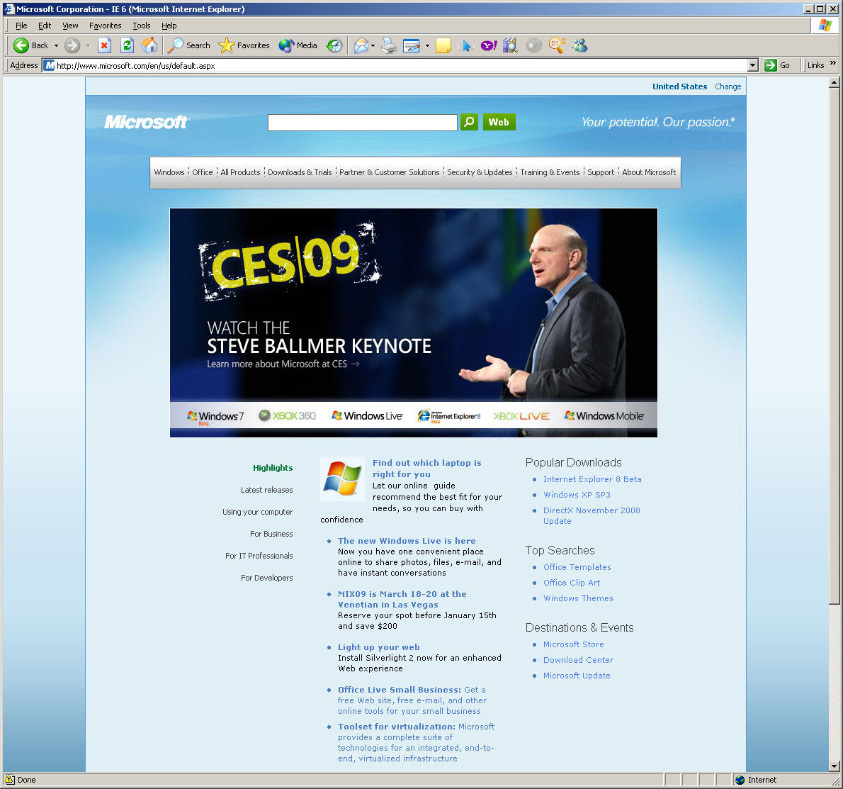
Wait, what? This looks even worse! Misaligned buttons, and now the dashes on the menu separators look terrible. Do the menus work, at least?
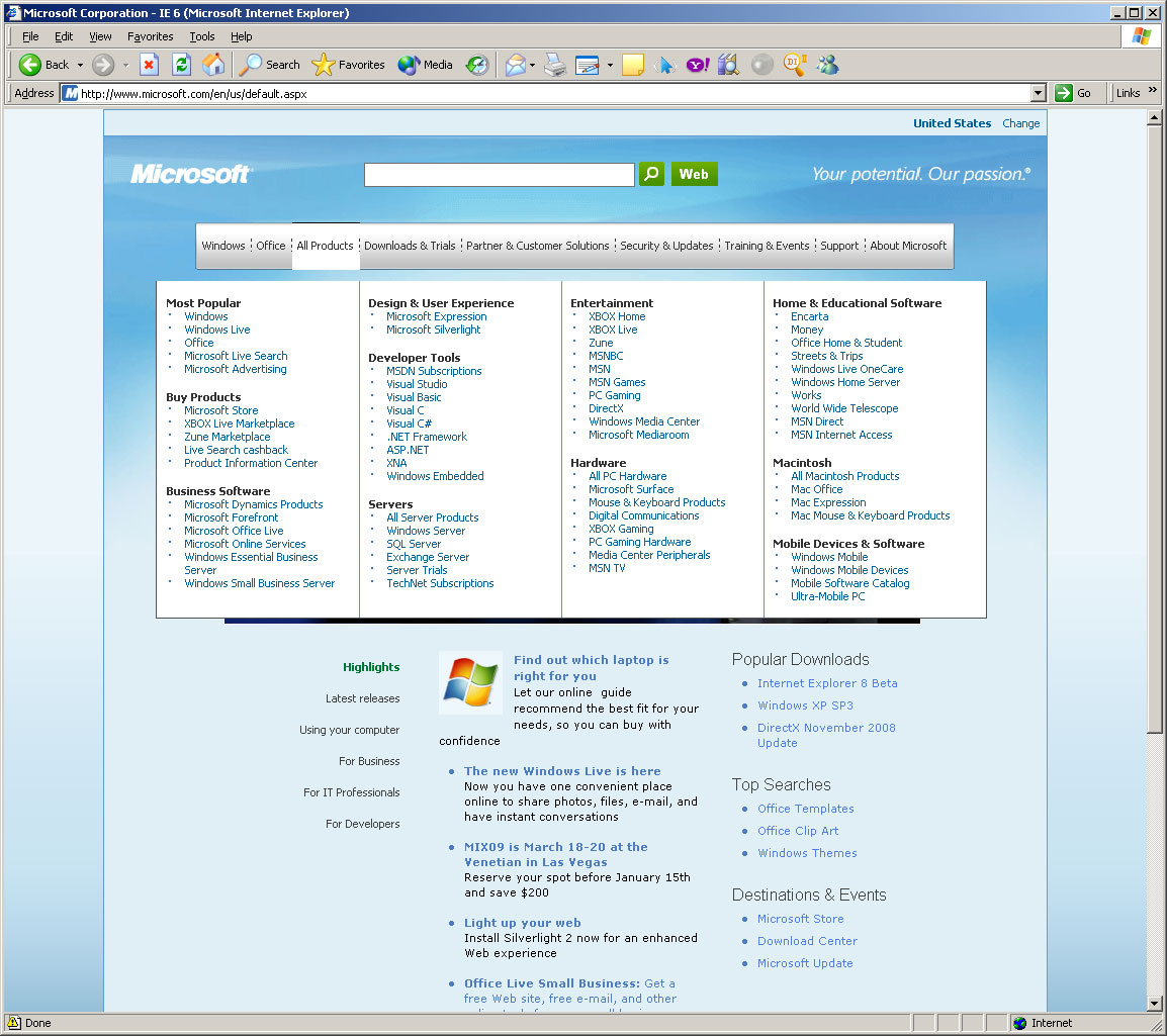
Ow! Big gap, looks even worse than the others. And note the presence of a black bar at the top of the highlighted menu item now, which indicates to me that there was at least at some point the intention of having the black bar there in all the other versions. Once again, the lack of a black border on top of the menu item itself looks strange. If you know this gap is happening in IE6, you could at least fix that. Oh, and if you happen to be mousing too slowly over that gap, the menu will close, because you've moused out of it.
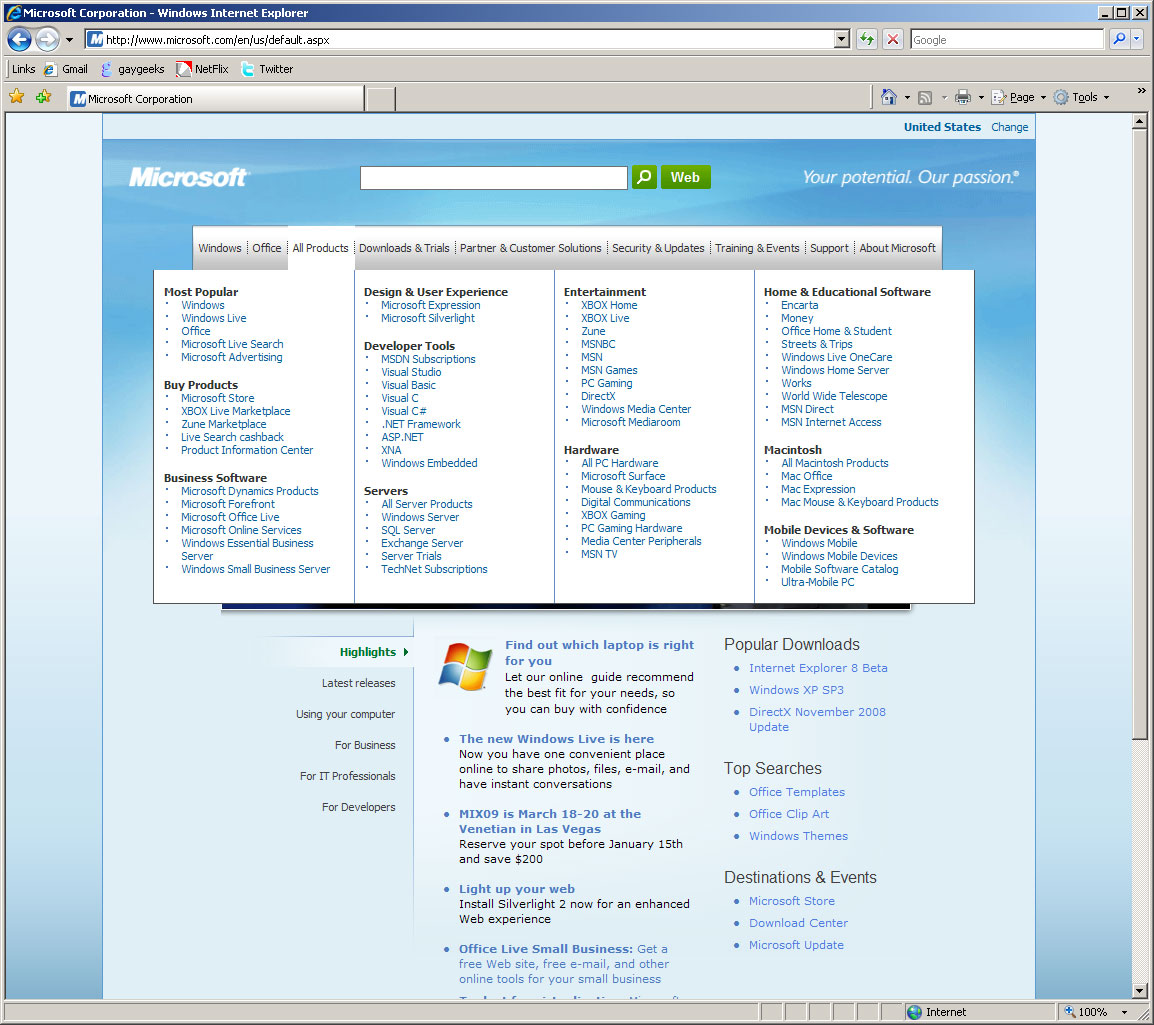
Wow, that's pretty terrible. I wouldn't have been allowed to ship a website with bugs like those, and even if they slipped through I'd have fixed them by now. But this page didn't launch just a week ago. Okay, fine, maybe Microsoft is doing what everyone else is doing, and started ignoring IE6 in hopes of making people switch (this site, for instance, shows IE6 users a horrifying red banner and an utterly broken page. IE6 can suck it). Let's look at it in IE7, Microsoft's flagship browser and the most popular single browser in the entire world:

And this is what made me decide to blog about this. Here it is, looking exactly the same. Same weird sizes, odd font choices, strange white space, green buttons are out of alignment The site actually looks better in Firefox. And the menus are still broken:
An open letter
Dear Microsoft: I know these are minor things. I'm sure consumers don't even notice, apart from maybe a vague feeling that your front page has a strange, unfinished look to it. A pixel here, a pixel there, who cares? You know who should care? You should. Either you have recognized the power of online advertising and want to become a major player in the web, or you don't. And if you do, then you have to start getting the web, which you currently do not. Here, for comparison purposes, is the front page of Yahoo!, as seen in Firefox:

This is also, down to the pixel, what the screenshot looks like in IE6, IE7, Opera, and Safari (though Safari's fonts are a little thicker). Now again, this is not a fair comparison. Your front page isn't a direct revenue-earner for you: Yahoo's front page is a huge chunk of revenue, measured in tens if not hundreds of millions of dollars. Obviously Yahoo! can afford to throw a few more engineers at the problem.
But come on. You're Microsoft. You have no shortage of money, or engineers, and this is your front page. This is why Yahoo -- and Yahoo's employees -- do not want to get acquired by you. You don't care about the web the way that we do, you don't get it like we do. You're a software company, not a web company, and those two things are not the same and that's okay. Keep building your operating systems. Try to make them dependable like Window XP and 2000, and not sucktastic like Windows ME and Vista. Just stop trying to be something you're not.
You've branched out successfully before. You got into office software after a late start and dominated. You have made huge strides in getting into gaming, and XBox 360 is apparently pretty cool. I like your hardware: I have bought a lot of Microsoft mice in the past, and I'm typing on your ergonomic keyboard right now. You can diversify successfully. But you know which diversification wasn't successful? MSN. Oh, wait, or is it called Live now? Whatever. After more than 10 years and hundreds of millions of dollars in losses, you run a distant third to Yahoo's already distant second to Google, and you're losing share, not gaining. It's time to admit defeat.
You're not a web company. Almost nothing you've done has helped the web. A controversial claim? Come on, give me the example of a great web technology by Microsoft. Silverlight is your proprietary copy of Flash. ActiveX, and the horrifically flawed security model that came with it, has been responsible for huge amounts of carnage. Your broken JScript and messy, incompatible DOM were also horrible, but you share the blame for those with Netscape. Although you were among the first to implement CSS, you were among the last to get it right. You did invent XMLHttpRequest, for which I must give you credit, even though you didn't actually use it for anything interesting until it was rediscovered years later, and innerHTML, which is convenient. But anything you might have contributed is drowned in the wave of awfulness that was IE6, or more specifically, the way you let IE6 sit there for 7 years without fixing anything, because you didn't have to, because you'd used your money to crush Netscape and you didn't care about the web. Now it turns out the web doesn't care about you.
Admitting defeat is okay. Blame the crappy economy if you like, the advertising slowdown, evil monkeys, Jerry Yang, sunspots, whatever. Sell MSN and Live -- sell them to Yahoo, in fact, and take a big but decidedly non-controlling ownership stake. We can help those poor, abused, broken websites; restore them pixel by pixel; train them, with love and patience, to stop lashing out at customers and irritating them with crappy UI and mangled user experiences. In time, they will flourish without you. You can stop striving to play with the younger kids, settle down, and find a big, profitable niche that nobody else wants, like IBM did when you beat the crap out of them in the operating system market.
Microsoft, you are not a web company. And that's okay.
* The opinions expressed in this blog and especially in this post are my own and not those of my employer, and are not endorsed, reviewed, or cared about by them. Additionally, I am not responsible for the code on the Yahoo! frontpage, and in no way claim credit for it. (I did do a lot of Yahoo! Widgets though, so feel free to viciously pick that apart. At least our drop-down menus look nice.)
