iPhoneTracker, Extra Creepy Edition
You may have heard about Pete Warden's iPhoneTracker, an app that lets you explore the giant trove of geolocation data your iPhone has been collecting since iOS 4.0 (and possibly before).
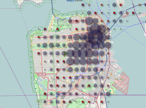
You may not know that the grid on Pete's released app is the result of his app deliberately aggregating the datapoints to a grid, in order to be a little less creepy:
if you zoom in you’ll see the points are constrained to a grid, so your exact location is not revealed. The underlying database has no such constraints, unfortunately.
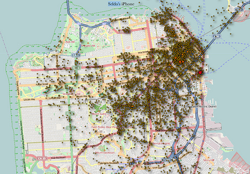
But hey, why should he decide how much we want to expose our location? Let's get super creepy! Following some instructions from a clever friend, I made the very simple change required to increase the granularity of the data shown on the map. Before:


Woah! Neat, right? If you want to try it out yourself, you can follow Nicole's instructions on your own downloaded copy of Pete's source from github, or if that's too much trouble and you trust me, you can download your own copy of the extra-creepy version of iPhoneTracker. I'm not very experienced with compiling desktop software, but this works for me, and I use OS X Snow Leopard, so it will probably work for Leopard OS X too.
Important note: "granularity" is not the same as "accuracy". Your iPhone is frequently wrong about where you are, by up to half a mile or so. So your data points will show on average about where you were, but there will be plenty of random outliers -- which is why I appear to spend so much time swimming in San Francisco Bay, for example.
Enjoy!
