A comparison of diversity at three major tech companies
Update 2014-07-23: added Twitter and Salesforce to the spreadsheet after they published their numbers.
Something really unusual happened recently: Google, then Yahoo, and finally today Facebook all released diversity reports, detailing how their workforces break down along gender and racial lines.
This is unusual first because this is data they previously kept secret, and also because of the striking uniformity of the reports -- they all chose to report in the same categories and even gave those categories exactly the same names. I'm not sure how that happened -- maybe they conferred, maybe there's a third party driving all three of them to do it -- but whatever happened, it means it's possible to do an apples-to-apples comparison of these three, which collectively employ around 60,000 people (Google is by far the largest company).
First up, gender breakdown across US employees:
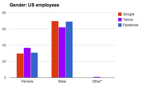
Unsurprisingly given what we hear about tech, men are over-represented. The only other interesting thing is that Yahoo is the only company to acknowledge a non-binary gender option (though they include "undisclosed" in that group, so it's not clear how many employees are taking advantage of that). But interestingly, all three companies chose to further break down their stats by "technical" and "non-technical" positions. None disclosed how they made that classification, but the results are strikingly similar. Here's non-technical staff:
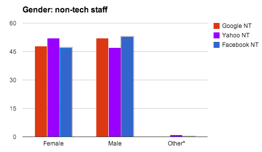
Not bad at all. But here's technical staff:
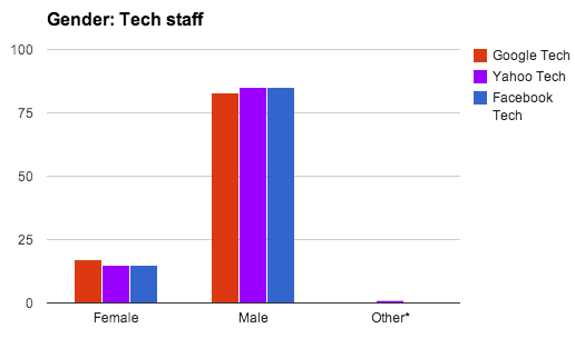
Boom. The problem with gender diversity isn't in "Silicon Valley companies" it's in engineering. In case you needed the point rammed home any harder, this is 100% tech's problem. The companies are doing generally okay, but the engineering organizations are ridiculous, averaging only 16% women.
The racial data has fewer surprises. Here's all US employees again:
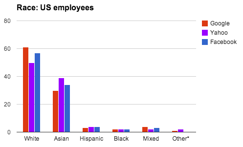
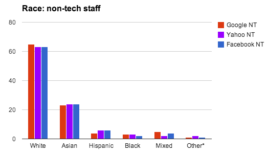
Again, I had to make no adjustments at all to this data. All three used exactly the same names for categories. Is there some national standard for reporting this data I'm not aware of, or is there some coordinated campaign? Anyway, these companies are hella white, and basically everybody who isn't white is asian. The breakdown amongst non-technical staff is pretty much identical across all three companies:
With the one surprise being in the data on technical staff:
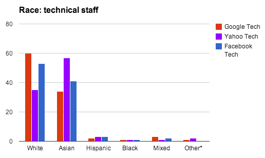
Yahoo's engineering staff is majority asian, by a huge margin. I triple-checked my data to make sure I wasn't getting this wrong, and that this is only about US employees (Yahoo India is a substantial organization). But no. For some reason Yahoo employs way more asians compared to the other companies, and all the "extra" asians are engineers. As an ex-Yahoo myself I can't say I ever noted this myself, but there it is.
What does this say about our industry? Nothing we didn't know before: tech companies are very mostly[1] white and very male, and engineering organizations embarrassingly so. Engineering orgs are also disproportionately asian (the Bay Area is 23% asian, and non-technical staff match that figure). But here's some nice, solid, clean data, all released in the same six-week period, to back that up.
If you want the actual numbers, you can save some typing by cloning this spreadsheet, which also has the charts from this post.
[1] Thanks to Tom Coates for suggesting I clarify this.
