I can't decide
I've been toying with ideas for a redesign to this site. The main goals of the redesign, in order:
- Bring the code up to date with modern standards. This horrible table/CSS mish-mash is 3 years old now and looks horrible in my favourite browser.
- Enhance usability by bringing the most commonly-viewed content to the front page and presenting it better. For instance, the blog is going to be split into "Linkage" and "Thinkage", one being links with commentary as I find them (almost banished at the moment) and the other being the longer, more reasoned pieces I do less often. I don't like the way they're mixed at the moment (this is a blatant rip-off of Jason and Tom, but hey, imitation is the sincerest form.
- Make it purdy. It's not ugly now, but I've decided I want a different look. I've been toying with an art-deco feel, because I love art deco: its intrinsic curviness appeals to me, and art deco was a reaction to excessive linearity and functionality in architecture which I feel web design also requires -- that's why the site is already so curvy; I want it to keep that feel.
- Add new features. It's high time I listed my daily blogs, my friends' sites, an RSS feed, etc.. It's 2004, need to start acting like it.
However, I can't decide what I want to do. So here's a selection of scans of doodles of the design I've been playing with. Please comment with suggestions and feedback!
(Key: the diagrams feature some abbreviations to indicate what kind of content goes where. These are:
- LL
- LifeLines, single-line summaries of my activity for that day, sent in by text message (mmmm, SMS gateway). Gives an always-fresh feel.
- LB
- LinkBlog, links I find with commentary
- B
- The main blog
- PX
- Pictures, intended to be taken by my camera-phone and updated frequently -- so a single most-recent picture on the front page, a la wabson a few design iterations ago.
- EL/OL
- External/Other Links: friends, blogs, etc.
- AB
- About box: a summary of the site for new visitors
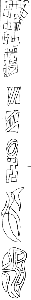 This first one was just a series of off-the-wall possibilities for funky layouts, none very practical, drawn in the margin.
 Another early one, very organic but too curvy to be practical I think. Let me know if you disagree though.
 Immediately after looking at a load of art-deco, I came up with this directly. It's very deco but there's just too much decoration and not enough content, I think
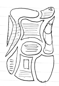
 Another "style over substance" design; it looks very pretty in my head (the background is shades of dark marble, the thick lines are gold inlay) but where the hell does the content go?
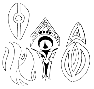 These aren't web pages. They're just stuff I drew in the margin and I think they're kinda purdy.
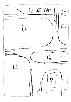
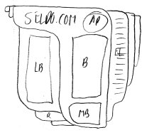
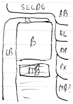 Having now decided what content will go on the front page, this was my first attempt to fit it all into a deco shape
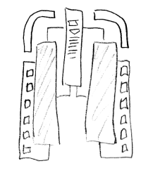
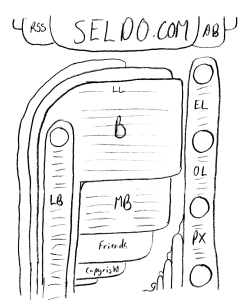 Another attempt to fit things into deco, a bit more coherent this time, but I don't like the three different shapes -- they don't seem to mesh well at all.
 This one looks a lot more coherent -- it's just one shape -- but it wastes too much space.
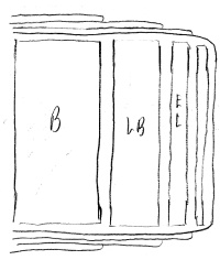
 All one type of shape, in different directions. No good.
 Deco features the winged motif, the interlocking, and the fibonacci-sequence style of spacing between elements a lot. Preliminary idea, developed into the following one:
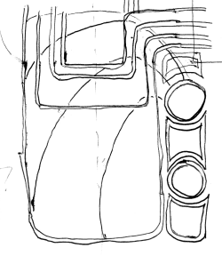
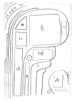
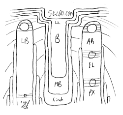 I'm seriously considering this one -- it's very very deco, and yet doesn't waste too much space. The central piece needs to be a lot wider relative to the two outside columns.
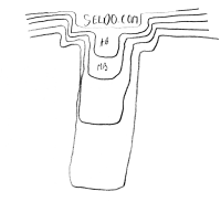
 Tried to go simple but deco. Horrible.
 Produced by letting my mind wander and just draw stuff where it seems to fit. This is a method that has worked before. It wastes not too much white space and is suitably deco, but doesn't seem bold enough.
So, let me know what you think...
