Five little problems with Twitter's UI
Okay Twitter, it's time you stopped getting a free pass. You have fucked up your interface, and it's time to fix it.
Before we get to the UI problems, let's reiterate the bigger, older problem, captured just a second ago:
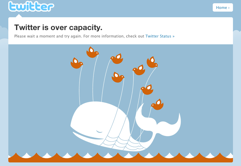
This was cute when you were tiny and still getting over early technical mistakes on the back-end, but you're over that now, you've taken over a billion dollars in funding, you are basically CNN's only news source at this point. You can't be throwing 500s anymore, no matter how cute the whale is. But your problems go much deeper now: even when it renders, your actual user interface is significantly less useful and elegant. Allow me to rant briefly about a few issues. While I'm waiting for the whale to go away so I can take screencaps, here's a shot of the old-old Twitter (via):
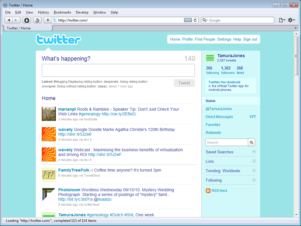
Problem 1: right-column layout
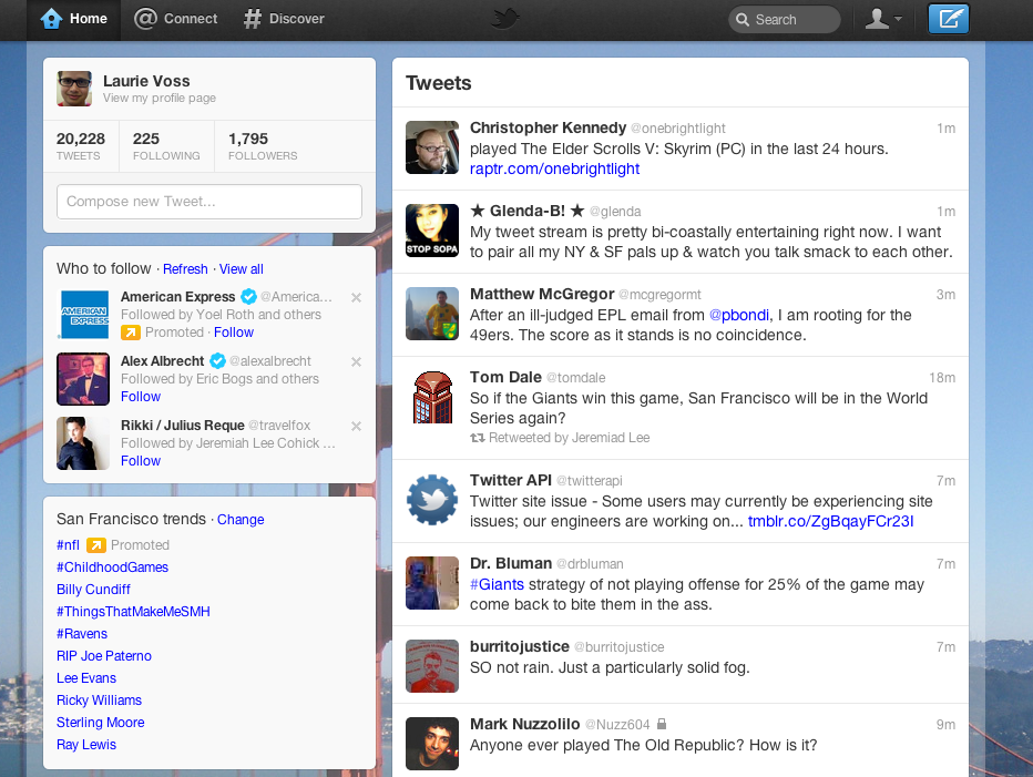
The new layout puts tweets down the right, and a mish-mash of useless junk down the left. I know why you did this: you needed to increase the amount of attention paid to promoted followers and trends, because that's your business model. I don't care. You are deliberately distracting your users from something they want to see with something they don't care about. This is the wrong way to do advertising.
Problem 2: tweet composition
Can you tell me the difference between these two ways of composing a tweet? This one is accessible from the left nav:
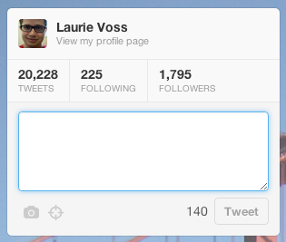
This one comes up if you click the blue button in the top-right:
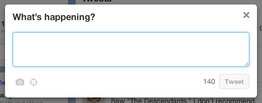
The answer is: there is none. They are totally different-looking ways of doing the same thing, both accessible from the top of the front page. Why would you confuse your users like that? If you think the top-right button is too hard to find, why is it there at all? If you think it's useful because it stays visible as the page scrolls, why not make the easy-to-see compose box fixed? Instead you have this weird dual-interface solution that reeks of committees and compromise instead of the great, simple design that you started with.
Problem 3: tweet controls
The basic tweet layout is pretty much unchanged since the beginning:

The friendly "posted X minutes ago" has been replaced by the context-free "27m", but that's a tiny matter. On hover, as before, you get some tweet controls, plus the new "open" link:

And here the real trouble begins. This is what happens when you click "open":

My payoff is that the controls jump to the bottom of the tweet for no clear reason, and I get a more exact timestamp. Is that worth a click? Then why is that link there at all? The answer is because if your tweet has more interactions, like retweets and favourites, you get those here too:
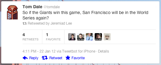
But that's an explanation, not a reason. It would be quite simple to not bother having an "open" link unless there was something interesting to show. But instead we have this weird cruft in the name of consistency. Again, it's a small thing, but all these little things are beginning to add up to a UI that isn't cared about.
Problem 4: conversation view
If a tweet is part of a wider conversation, clicking "open" gives you a lot more context, like so:
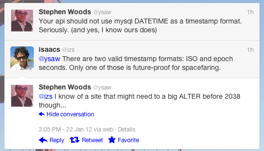
Display of larger conversational context is a good idea. But there are two issues: first, the back-end implementation sucks. If I respond twice to your tweet before you reply, that second tweet is lost from the conversation. Sometimes you get the whole conversation, sometimes just the immediately preceding tweet. It's inconsistent and confusing.
And the UI is also inconsistent and confusing: two of the tweets have short timestamps, one has a long. The "hide conversation" close the whole conversation, but uses the same icon as "reply" and is right next to it. In the top-right, where you'd expect the "close" button to be in any other context, there's nothing but a timestamp, unless you hover, where you get this:

So now I have controls for this tweet, and also a "details" link which... closes the conversation, in total defiance of its label. Unless you right-click and open in a new tab, in which case you get the details page for a tweet. Why have a link that only does what it says if you right-click? Why can't I get more details of this tweet inline?
Here's how it should work: I'm looking at a list of tweets, and the bottom one is highlighted. If I want to close the list, there should be a close button in the top-right. If I want details about a tweet other than the last one, I should be able to click it. Is that so hard?
Incidentally, there is a close button for the conversation that's correctly labelled. You get it if you hover over the final tweet:

...right where the "details" link is on the other tweets. And it does the same thing that the already-visible "hide conversation" link did anyway. What on earth is the point?
Problem 5: interactions
This one is so obvious I can't believe it's not been fixed already. This is the default view of the (poorly-named) "@connect" tab:
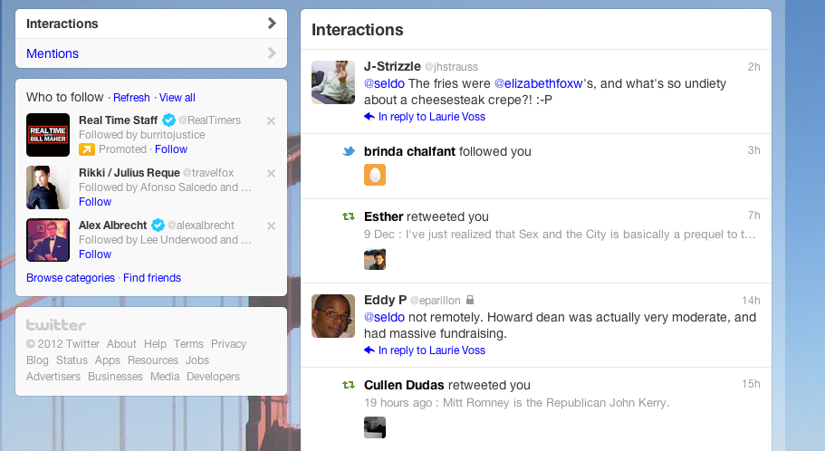
This view is clumsily mixing together two totally different use-cases. The first is @replies: these are frequent, personal, and demanding of your attention. They are high-value. The second is retweets and favourites: these do not require response (good, because the UI doesn't let you respond anyway), and happen asynchronously: you don't care when a particular retweet or favourite happened to any degree of precision -- so why is it in a timeline? Not that Twitter actually tells you when it happened anyway, since the UI batches up reponses:

It's not like there's not a great, usable UI for handling interactions that already exists to model from: Favstar.fm nailed it years ago. Show tweets in the order they happened, batch up all responses. It's not hard.
And as another tiny little thing: if the "Mentions" link lets you filter down to only @replies, why is there no equivalent "responses" link that lets you filter down to only retweets and favourites?
TL;DR
The New New Twitter has dozens of small, irritating design choices and UI inconsistencies. None of them by themselves is worth a whole post, but together they add up to enough brokenness to complain about. I've tried to keep things constructive by suggesting how they should look instead.
The new look has been out for over a month now and there's been no sign of iteration to fix these things. We wouldn't put up with this crap from Facebook. It's time to fix it.
P.S. Dear commenters, before you immediately point out the many, many UI flaws in this blog, I reiterate that Twitter has a billion dollars, while I maintain this blog in my very rare spare time. I expect more from them, and so should you.
